Wars rage, tariffs rise and fall, and consumer sentiment wanes.
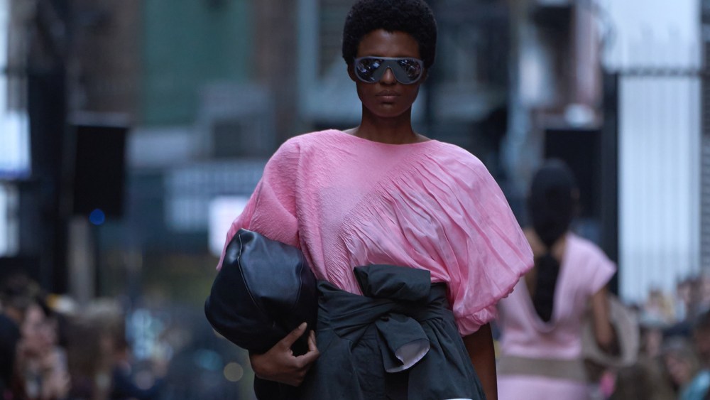
But don’t expect a gloomy consumer sentiment to put a damper on the anticipated colors of the season. In Pantone’s NYFW Fashion Color Trend Report, there’s “a spirit of quirkiness and originality,” said Color Institute executive director Leatrice Eiseman. “When I look at the combinations that are now being worn, particularly with the younger generation, they have no problem mixing stripes and dots and plaids and all sorts of things that were, at one time, a no-no.”
Musing about combinations of the anticipated shades, Eiseman said: “You would call these quirky combinations. You have a lot of opportunity for some unique combinations, and that is one of the biggest stories for these top 10 colors.”
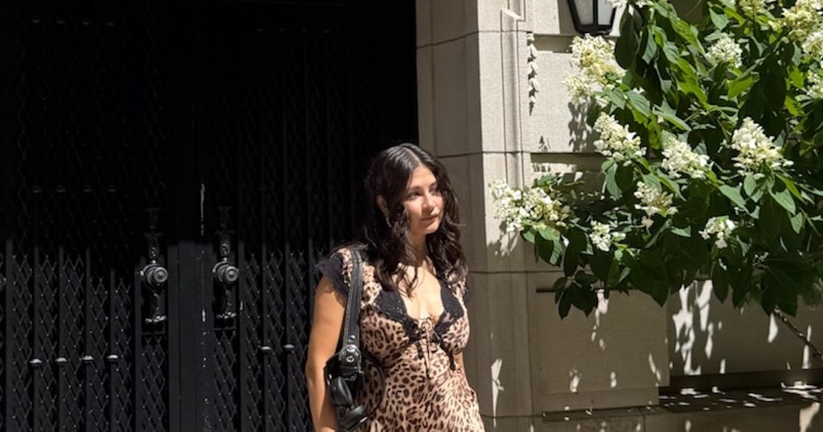
Similarly, two pinks made the cut — Dusty Rose and Tea Rose. The magic is in the mixing. “It’s obvious you could use those colors to get two very romantic roses. But take one of those and use it with Lava Falls, a dramatic red, and that’s where the quirkiness comes in,” Eiseman said.
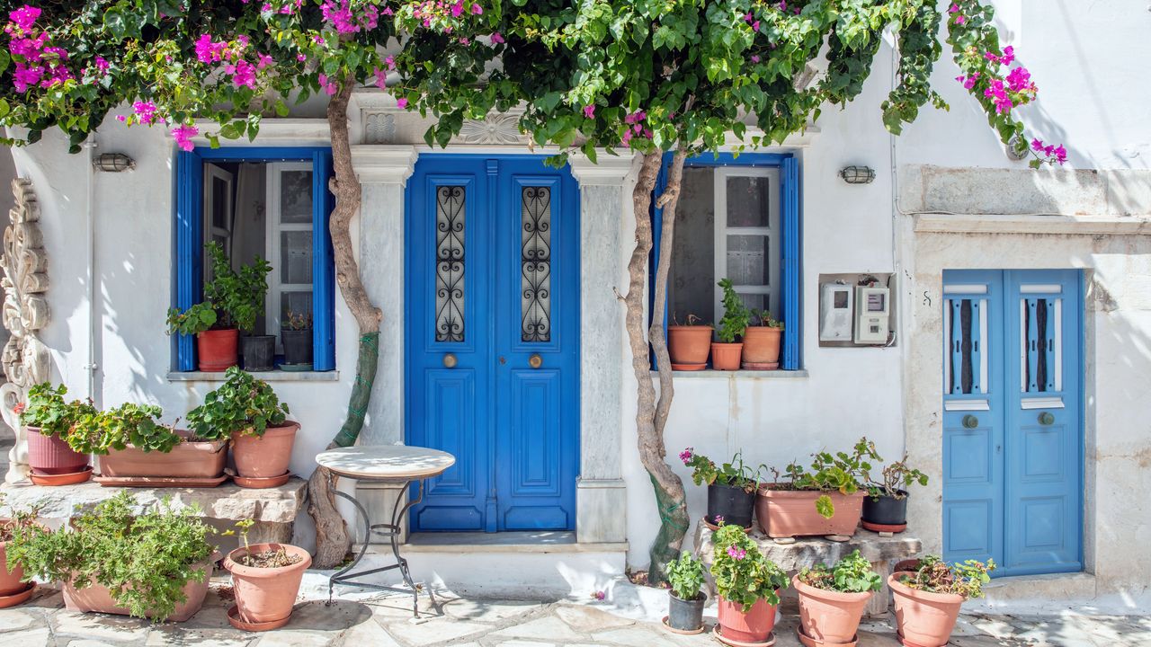
Part of that, she reasoned, had to do with growing interest in vintage fashion, and the ability for shoppers and designers alike to marry trends and pieces from both past and present.
“Combining the old with the new, wanting something to look fresh, wanting something to look original, much of it is being reflected in the way that the colors are being put together,” Eiseman said.
With that in mind, the seasonless shades in the report offer a few twists — green is a neutral now, for example — and the emphasis is more on grounding and comfort than it is on a colorful clash.
“We discovered when we did Peach Fuzz as color of the year that the tactility of the shade is so important,” Eiseman said. “People gravitate to fabrics that they like to touch.”
With both Sage Green and Sycamore in that lineup: “I tell my clients all the time to think of green as a neutral color. If you think in terms of accepting green as a neutral color, that has definitely played into expanding how we consider neutrals.”
Spring 2026 Color Palette:

Pantone’s Acacia 13-0640
Courtesy of Pantone
Acacia 13-0640
“A green-infused yellow, combined with a maritime blue. That combination is very striking,” Eiseman said. “You might say those have been used before, but there’s a specific way that it’s being used now that’s bursting with energy, yet calm.”

Pantone’s Marina 17-4041
Courtesy of Pantone
Marina 17-4041
“A maritime blue,” Eiseman said, pointing to Acacia as a likely complement. “That combination is very striking.”

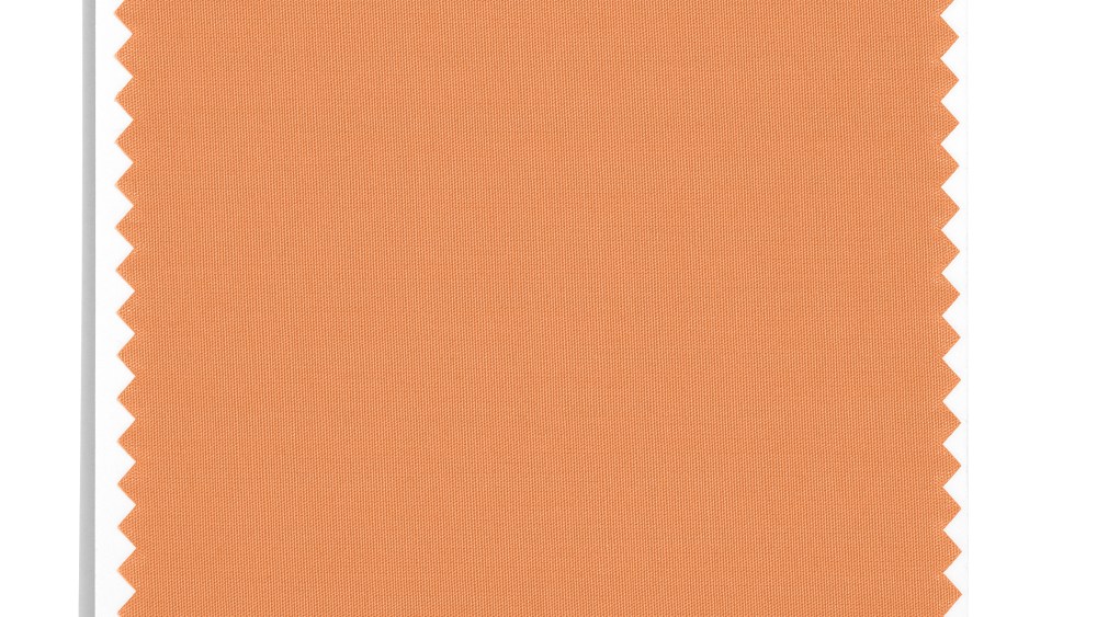
Pantone’s Muskmelon 15-1242
Courtesy of Pantone
Muskmelon 15-1242
“A fragrant, vinyl orange,” Eiseman said, “meant for color-blocked pairing as much as wear in its own right.”

Pantone’s Alexandrite 18-4835
Courtesy of Pantone
Alexandrite 18-4835
“That blue-green is one of the most preferred shades,” Eiseman said. “Many people wouldn’t think of wearing a deep teal for spring, but we’re talking about combinations.”

Pantone’s Lava Falls 18-1552
Courtesy of Pantone
Lava Falls 18-1552
“Take a Lava Falls red shirt, for example,” Eiseman said. “This is for, ‘I’m going to feel more empowered today.’”

Dusty Rose 17-1718
Courtesy of Pantone
Dusty Rose 17-1718
More romantic than its other rose counterpart, Eiseman suggested paring it with Lava Falls.

Pantone’s Tea Rose 16-1620
Courtesy of Pantone
Tea Rose 16-1620
“A more red-toned rose,” Eiseman said, which connotes more tactility than its Dusty sister shade.

Pantone’s Amaranth 19-2410
Courtesy of Pantone
Amaranth 19-2410
“It’s a mysterious color,” she said. “As purples often are, that’s kind of unexpected in the spring time. Think of that shade used with a soft, sage green.”

Pantone’s Burnt Sienna 17-1544
Courtesy of Pantone
Burnt Sienna 17-1544
“Burnt Sienna is an earth tone,” Eiseman said of the shade, which is described as a “russet red” that evokes the natural world.

Pantone’s Burnished Lilac 15-1905
Burnished Lilac 15-1905
Burnished Lilac takes hues from the growing interest in vintage fashion, Eiseman said, finding it reminiscent of vintage and perfumed settings.
Seasonless Shades

Pantone’s Coffee Bean 19-0915
Courtesy of Pantone
Coffee Bean 19-0915
“We saw when we had Mocha Mousse as our color of the year. This is a wonderful, chocolatey shade that goes beautifully with so many of the top 10 colors we selected,” Eiseman said.

Pantone’s White Onyx 12-4300
Courtesy of Pantone
White Onyx 12-4300
“In springtime, this is a given,” Eiseman said. “Seeing white in the spring season is not unexpected.”

Pantone’s Rhodonite 19-3838
Courtesy of Pantone
Rhodonite 19-3838
“It’s unusual to have a navy blue, but that color has become more of a seasonless color,” Eiseman said. “We have seen it used more transitionally between seasons.”

Pantone’s Angora 12-0605
Courtesy of Pantone
Angora 12-0605
“Angora is a very soft beige, it’s what we call a tactile color,” Eiseman said. “It has a soft, fluffy feel.”

Pantone’s Sycamore 19-5917
Sycamore 19-5917
“It’s a deep forest green — it was interesting to see how many designers are utilizing that color,” Eiseman said. “It’s a color that’s rooted in the earth, and we know that nature, preservation of the environment comes to mind. That is part of the conversation today.”

Pantone’s Sage Green 15-0318
Courtesy of Pantone
Sage Green 15-0318
“Sage Green is a very balanced and relaxing color,” Eiseman said. “You can see how this would play into the zeitgeist, and into the mood. How we can draw in other things people are concerned about, use them in fashion, and give that as an insight.”
#Pantones #NYFW #Fashion #Color #Trend #Report #Reveals #Quirky #Combos